Need help planning your Family Outfit Palette? Look no further, coordinated with these helpful tips!
One of the most common questions I get before a family session is,
“What should we wear for our photos?”
It’s such a good question because what you wear can completely change the look and feel of your portraits. You want your family to look cohesive but not like you’re wearing uniforms. The goal is effortless coordination that lets your personalities shine.
Here’s how to put together a colour palette that photographs beautifully, without looking too “matchy-matchy.”
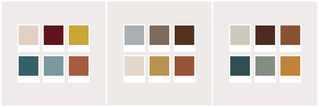
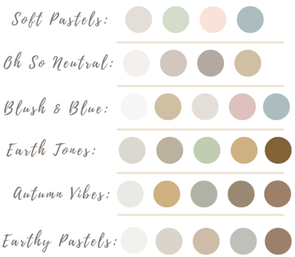
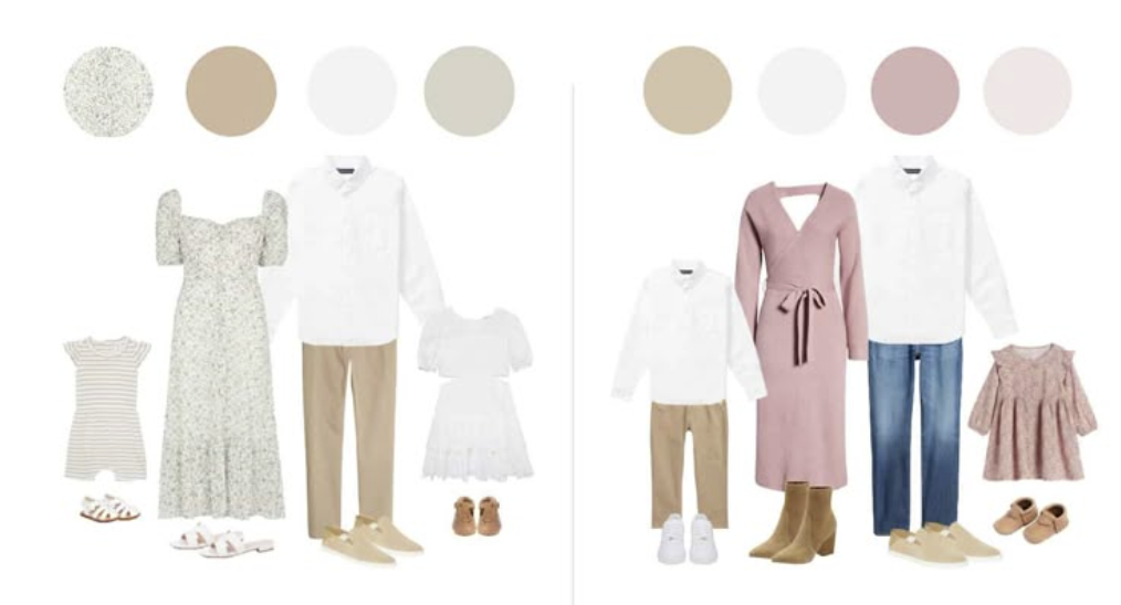
🎨 1. Start with a Colour Palette, Not an Exact Match
Instead of everyone wearing the same shade (like all white shirts or all jeans), pick 3–4 complementary colours and mix them throughout your outfits.
Think of it like decorating a room, you want variety, texture, and balance.
Try this:
- Choose one main colour (like navy, olive, or rust)
- Add one neutral (cream, beige, taupe, or grey)
- Include one or two accent colours (mustard, blush, sage, or denim blue)
💡 Pro tip: Look for colours that complement your home décor — you’ll likely display these photos there! If you do print and hang your images, be sure to share them with me, I love seeing them!
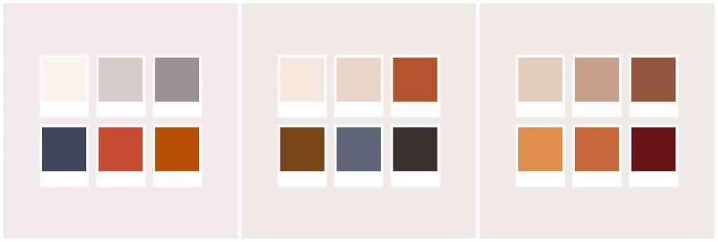
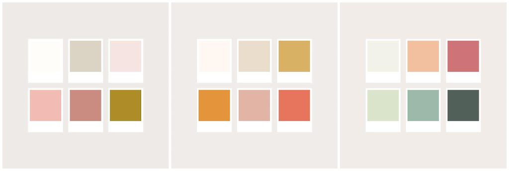
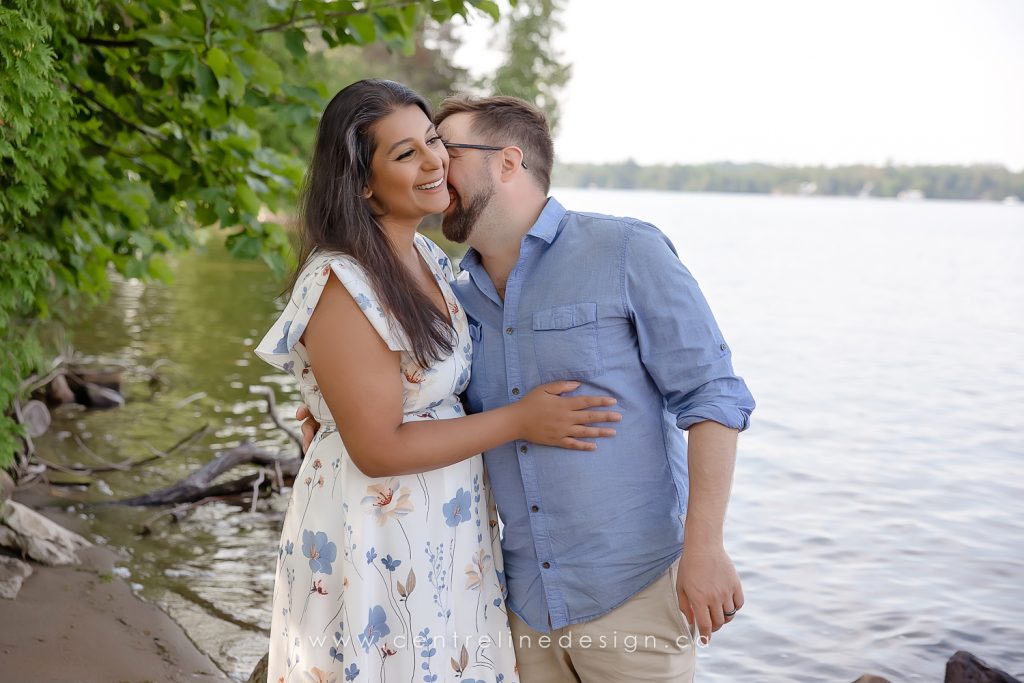
👗 2. Coordinate with Tones and Textures
When outfits share similar tones (all warm shades or all cool shades), everything feels naturally coordinated.
- Warm palettes: Rust, cream, mustard, olive, and soft browns
- Cool palettes: Navy, denim, sage, soft blue, and greys
Add texture for depth: knit sweaters, linen shirts, flowy dresses, or corduroy pants photograph beautifully and add interest without busy patterns.
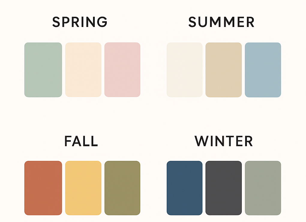
👨👩👧 3. Dress for the Season
Your location and season play a big role in colour choice. Think about the temperatures we will be shooting in.
Your clothing should feel natural for the time of year and the type of location we’re shooting in. This helps everyone look comfortable and authentic in the final images.
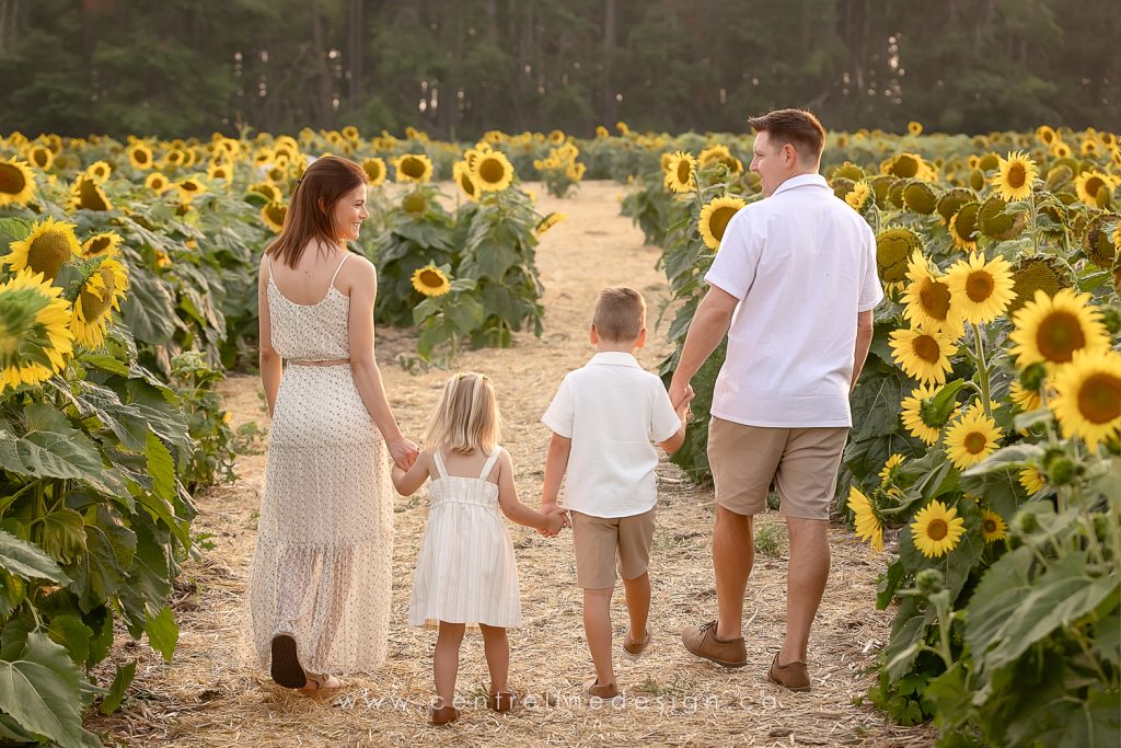
Summer:
Keep things light and airy! Flowy sundresses, soft cotton shirts, or linen button-ups photograph beautifully. Choose breathable fabrics that move with the breeze, they add softness and life to your photos. Sandals or bare feet work perfectly for outdoor sessions by the water or in grassy fields.
Fall:
Layer up with cozy textures, knit sweaters, denim jackets, scarves, or boots. Earthy tones like rust, cream, and olive pair perfectly with fall foliage. You can add in some cute boots, or snazzy cute shoes this time of year as well.
Winter:
Bundle up stylishly with wool coats, scarves, and textured knits. Neutral layers (camel, charcoal, navy) photograph well against snow or darker backdrops. Plan ahead incase you need a warmer jacket, or ask me about a back up plan to photograph in the studio if the cold outdoors don’t work out.
Spring:
Think fresh and soft floral prints, light cardigans, and pastel accents. It’s a great time for flowy fabrics and gentle colour contrasts.
Pro tip: Bring layers like scarves, cardigans, or jackets to add variety to your gallery.
Extra tip: Remember to wear bug spray! Cover those legs, or ankles that are showing. Less stress about getting a
🌿 4. Avoid Loud Patterns and Large Logos
A little pattern can be beautiful, think subtle florals, or small prints, but avoid bold prints that dominate the frame or clash with others’ outfits. These tend to look dated more quickly and you might grow tired of seeing those images on your walls faster.
Logos and text can be distracting in photos; keep things timeless by sticking to simple, classic pieces. Solid colours are best.
💕 5. Make Sure Everyone Feels Comfortable
When everyone feels good in what they’re wearing, it shows in the photos. Encourage your family to wear clothing that fits well and allows for movement, especially for kids! Try things on a week or two before the session to make sure everything fits. Buying clothing too early can backfire, kids grow quickly at times!
Comfort = confidence, and confidence = beautiful, genuine smiles.
If your using similar colours, look for different textures, and tones. Try not to wear the same outfits on multiple family members.
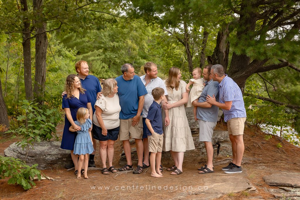
For extended family sessions, stick with a couple colours and then ask for family members to add in neutrals to help balance it out.
If there is a pattern one someones outfits, pull colours out from it and work with those colours.
📷 Bonus Tip: Lay Everything Out Together
Before your session, lay all the outfits side by side (or hang them together). You’ll quickly see whether the colours and patterns feel balanced. Works great if you can hang them in the living room, where you might hang the finished images to get a feel for colours next the wall/decor colours.
If something stands out too much, swap it for a neutral piece or tone down the pattern.
You can even use an online tool like Coolors.co to test colour combinations before you buy or plan your outfits.
A fun app to help you out is Adobe Capture! Take a photo of one outfit, maybe mom’s outfit. If it has a bit of a pattern with colours, the app can help pull out colours from it to show you your own palette and gives you inspiration on what to look for the rest of the family!
There is lots of inspiration online, and you can reach out anytime if you need some guidance. I’m happy to help!